

AccuWeather
ReDesigning an Iconic Service
Product | UX | UI | Mobile | Case study
A company formed to provide commercial weather forecasting in the 1960s, AccuWeather has now grown into a meteorology juggernaut. It surpassed 40 billion service requests per day, making it almost 6 times that of Google’s. Everything about the service speaks to its history. Starting with 15 day forecasts, by 2016 it is able to forecast up to 90 days into the future. Its platforms are just as expansive, spanning any and all media platforms you can imagine, from print to TV to watches to web to Android to iOS and everything in between. Here lies the core of AccuWeather’s design flaw, EVERY single platform has its own design language. And it is here that this project begins, aiming to consolidate and redesign every facet of AccuWeather’s app.
Yes, a COMPLETE redesign.

INtroduction
AccuWeather’s mobile iOS app design is outdated, even though it was redesigned by its internal team not so many years ago. The times have not been too kind to it.
For my process, I started with user research, finding user’s pain points and opportunities to address them, as well as competitive market analysis. Then I created some task flows for the app, and then mapped out the interactions and feature set. After that I moved on to Balsamiq to create high-fidelity wireframes, then ending in Sketch to finish the final UI design deliverables.
Research was conducted by me, whether it was introducing it to people for the first time or they were already users. Here was some of the design feedback:
Loved
“I liked how first time if gave me an auto popup (Integration with Apple Watch)”
“It actually shows real location”
“Radar feature is cool, but i never use it (some NA only, some region only)”
“Cool looking bar graphs”
Disliked
“When I pull down to refresh lags, not clear enough visually, and choppy”
“I need to pull down alot further than other apps, sometimes when driving thats not safe to have to confirm if its refreshed”
“Why doesn’t the default doesn’t show hourly or daily, and I have to scroll down a lot (even though a lot of left over screen real estate)”
“Big empty space on the main page”
“Too many ways to get to 1 page, but some other pages are hard to find”
“I can’t click out of the menu button…”
“Ok, why is the radar or map thing left of main, but last on menu”
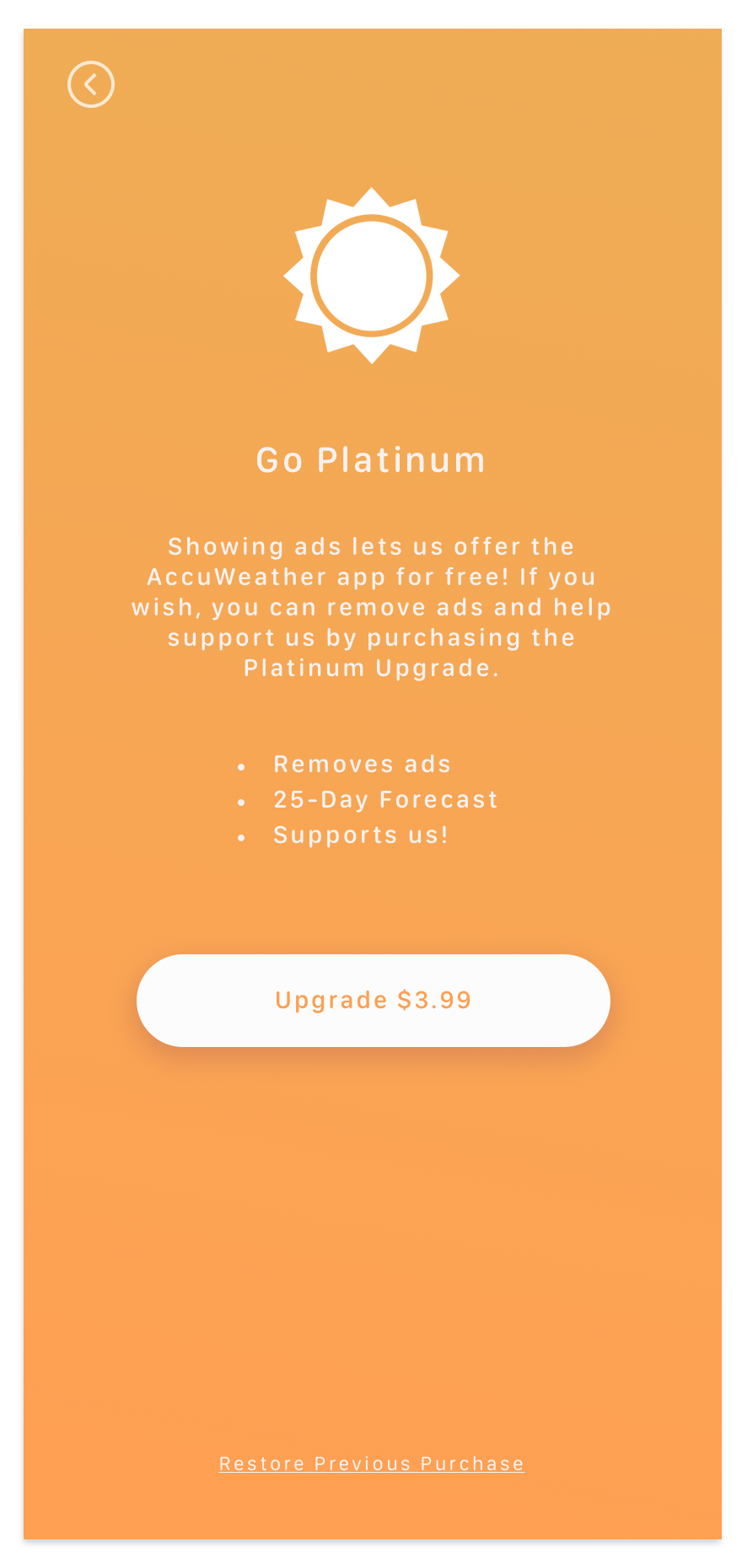
One aspect that I made sure to focus on was a wholistic approach to the redesign, taking into account business needs of the app into the design. This meant leaving room for ad spaces, since the app is provided on the App Store for free. Also its premium version, AccuWeather Platinum, was highlighted more than the design now, to encourage people buying and supporting the app through that channel.

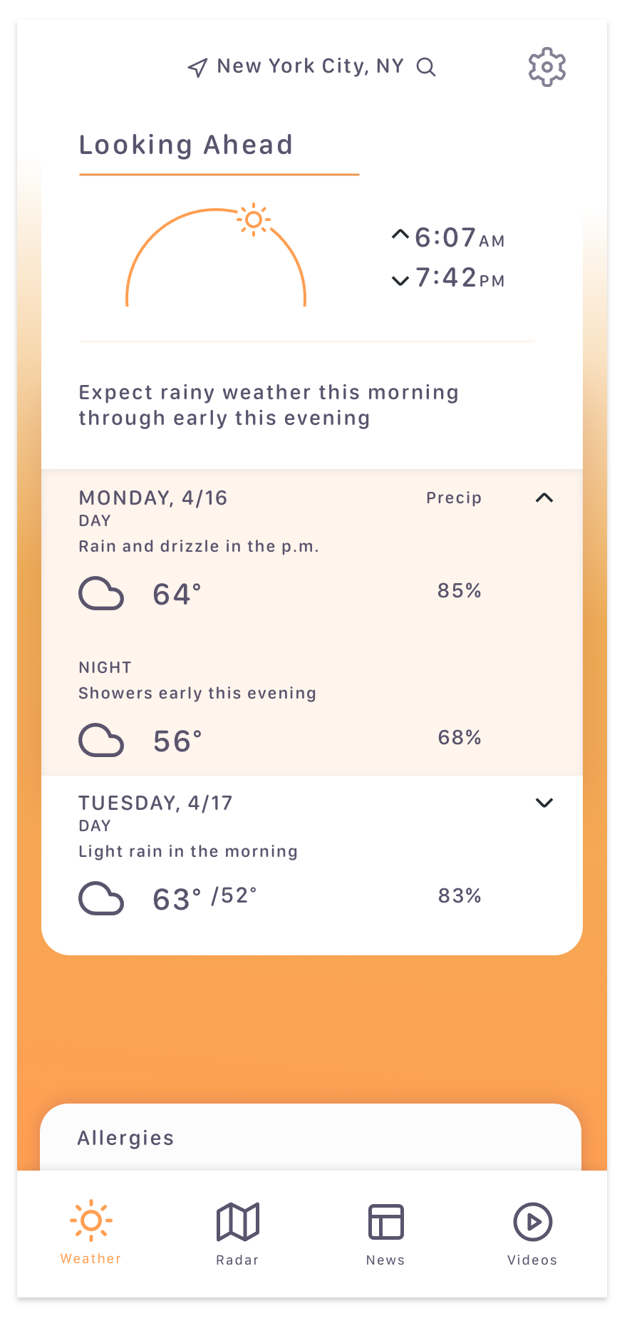
Again the focus here was to clean up the logic flow and the very complicated and confusing information architecture. The entire app, and more specifically the landing page, also the main page is redesigned to be much contemporary, lots of negative spaces, but still filled with crucial information. In fact, this redesign sacrifices NOTHING in terms of functionality compared to the design now, but is much cleaner and the information is much more readable, at the same time all of the information architecture is cleaned up and made much more accessible and intuitive.
The app is now sectioned into navigation tabs at the bottom, whereas the original it was an endless scroll, with hidden menus everywhere. All weather related information are now condensed into cards that snap in, allowing precise control when swiped up and down.

The redesigned UI focuses on readability, a clean modern look, and organized information.
This design is responsive to all mobile device screen densities and resolutions. Empty spaces are left for advertisement implementation, since that is their current business model and possibly main revenue driver for the app.


Conclusion
There is much to be done to the service’s design language and style guide as a whole, but the mobile app is the easiest and most convenient way people now consume information out of all the AccuWeather’s platforms.
Beginning with redesigning the information architecture of the app, simplifying all task flows, and condensed into a much cleaner visual design, the app now has a much more cohesive look and feel. From the way it is interacted to the way it presents itself visually. This is all done while taking into account business needs of leaving room for ad banners and larger ads, as well as an emphasis to promote its premium mode, which removes all ads (giving more room for information) as well as unlocking the 25-day forecast.
Of course it is not done, because compared many of its competitors, it is lacking in many features. But at least it is now brought into the modern era of usability and visual style.